Richard Hill

Judgement for AI-mediated work

Category: Analytics

  • Model a business: simulate industrial processes

    Model a business: simulate industrial processes

    There comes a point when your spreadsheet models of business processes just don’t cut it. You observe some complexity that is just too difficult to explore. You have questions that remain unanswered because you can’t do the analysis. One way of tackling this is to model a business so that you can simulate it and gain some useful insight.

    We are going to look at an everyday approach to creating a model of an industrial process or service. We shall consider how we can ask questions of the model and use that to improve our understanding.

    With this understanding we shall then look at building a simple tool to simulate the operation of the process and thus, model a business. This simulation will produce results that we can use to experiment with different scenarios so that when we go back to the business, we can take more informed actions.

    First, we need to understand the system.

    Understanding business operations to model a business

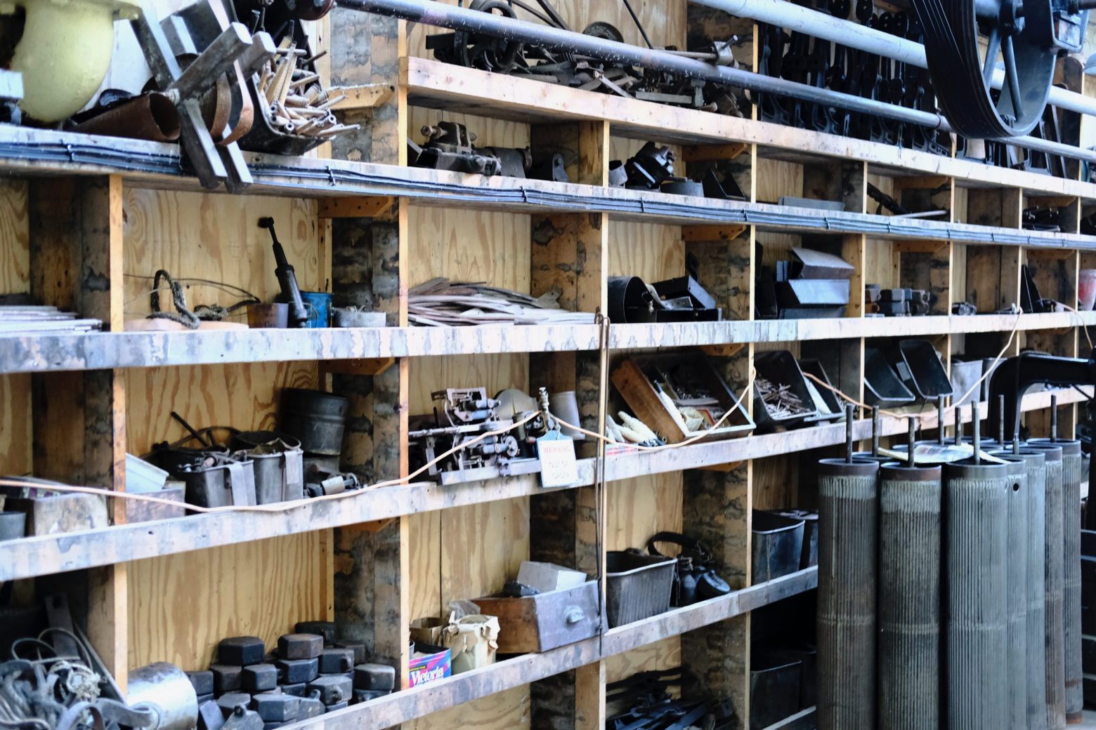
    Manufacturing facilities vary in both size and complexity. One factory might have two or three areas where different processes take place. Another factory might contain hundreds of machines.

    Each of the factories will have evolved to cope with the manufacture of different products, different mixes of order types, different customer demand profiles, varying quality of raw materials, unpredictable machine breakdowns and so on.

    The list of possible interruptions to a neatly ordered continuous flow of efficient output is endless.

    Shop floor supervisors manage these variations using their analytical skills and experience. At some point during the working week, they’ll be required to answer the following questions:

    1. When will order X be finished?
    2. How much stock is tied-up in the factory?
    3. What is the utilisation of the work centre?

    These questions might be asked by different stakeholders.

    Question 1 probably comes from the customer, via the sales department, perhaps because the order is late.

    Question 2 might come from purchasing who are concerned with re-order quantities for input materials. Or it might be the accountants who are assessing cashflow.

    Question 3 is certainly asked by the accountants, so that they can put a measure on the production potential of a factory. But it is also posed by the planners who want to find additional production capacity for more customer orders.

    In a smaller organisation these roles may be undertaken by the same person. In larger companies the functions will be separate departments. Whatever the size of the facility, the questions are the same. The answers are likely to be the same also.

    When faced with such questions there are too many variables to consider, for you to make a reasoned judgement. Such answers start with “it depends”.

    Attempting to quantify the lateness of an order is dependent upon the jobs in front of the late order, the reliability of the process, whether the operator is working at peak performance, the quality of the tooling and raw materials, etc.

    If the process in question is fed, or feeds into other processes, the opportunities for error are compounded. This leads to the use of estimates which might be generous and therefore may build inefficiencies into how we manage the overall operations.

    What we need is a model of the facility. This model captures the essential characteristics of the business unit and lets us change some of those characteristics so that we can see what the effects of those changes might be.

    Our supervisor might have had an idea to reduce the batch sizes of their orders, but not felt able to try it out as their machine utilisation measures might drop.

    If something went wrong and an order was late, the change initiated by the supervisor might be cited as the cause of the reduction in output.

    But if that change could be applied to a model, that has no physical connection to the real facility, perhaps we could learn more about how the system behaves. If we understand the system better, we stand to make better decisions in the future.

    This practice is referred to as simulation and it has long been the preserve of industrial mathematicians, or scientists who study operational research. Such work creates a lot of value for organisations, by creating models and allowing production personnel to experiment with different strategies.

    However, these mathematical approaches are often inaccessible and significant training is required to interpret the models.

    We can often obtain much of the benefit of simulation without the need for advanced mathematical skills, and this is the approach that we shall take in this article.

    Everything is a queue

    Let’s assume that you visit the local supermarket to buy a few items. You select your items and make your way to the checkouts to pay for the shopping.

    There are a number of checkouts in the supermarket but for some reason only one of the checkouts is operational. You are not the only customer in the store, and there are three other people already at the checkout, waiting in a queue to be served.

    When they have been through the checkout, it will be your turn to be served. Fig. 1 illustrates the scenario.

    queueing model of a supermarket checkout
    Fig. 1 Supermarket queueing with one checkout

    We are going to assume that each person and their shopping in the queue represents one job.

    Just for a moment, think about your answers to the following questions:

    1. When will your job (you and your shopping) be finished?
    2. How many jobs are there in the queue?
    3. What capacity of the checkout is utilised?

    You may recognise these questions from earlier. What was your answer to Question 1?

    Since we don’t know how long it takes to process any of the shopping, we would have to say “it depends”.

    It depends on how much shopping each person in the queue has; this might range from a hand basket to an over-laden trolley.

    Question 2 is a little simpler. We know that each person and their shopping is classed as a job, so we just count the number of jobs in the queue. If there are three jobs waiting in front of you, there must be a job in progress at the checkout, which makes four jobs.

    And then there is you, bringing the total to five.

    And what about Question 3?

    When thinking about utilisation we need to consider potential interruptions such as:

    • the checkout operator being changed at the end of a shift;
    • a request from a customer services supervisor for a price because the barcode on an item is unreadable;
    • a power cut causing the till to stop working.

    If there is a queue of customers, and there are no disruptions to the actual process, we can assume that the checkout is kept busy. Once the queue becomes zero (all the jobs have been processed), or there is an interruption, the checkout becomes idle and the utilisation drops to zero.

    Now that we have a basic representation of our supermarket checkout in place, let’s see how we can alter the performance of the system.

    The supermarket manager realises that if customers have to queue for too long they may become frustrated, or even leave the store without making a purchase. This is not good for business, so another checkout is opened up as in Fig. 2.

    supermarket queueing model with two checkouts
    Fig. 2. Supermarket queueing with two checkouts.

    Now, you approach the checkouts and find that there are two checkouts working. Each checkout is processing one job each, with a queue of one job waiting also. You are free to join either queue.

    Let’s assume that it takes the same amount of time to process each job. If that is the case, since both queues are shorter, you will have to queue for less time before your job is processed. The utilisation of the checkouts reduces however, unless there are more jobs arriving behind you.

    We can thus deduce that there is some form of relationship between the number of available checkouts, the number of jobs to be processed, and the overall time taken to process an individual job.

    If the supermarket manager had such a model, they could experiment with the optimum number of checkouts to service their customer demand patterns. This would help them allocate the correct number of checkout staff for busy periods, while reducing the instances of checkouts being idle during quieter times.

    The model would permit them to plan for seasonal adjustments in shoppers’ behaviours.

    But, if the model can be executed quickly, it could also be a tool to explore a scenario that is unfolding – such as a large influx of customers that were unexpected – and this is where modelling and simulation can become a powerful tool for the management of business operations.

    Modelling an industrial process

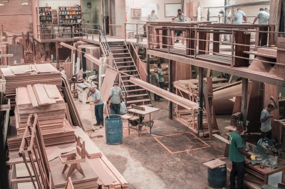
    We shall now consider an industrial scenario. A joinery company produces wooden window frames. Each of the frames is cut from lengths of timber that are shaped and cut to length by a machine.

    The company receives orders of varying quantities of windows, which means that varying numbers of timber lengths are required from the first machine. The company only cuts timber lengths for orders and does not make products to put into stock.

    Each order is considered to be a job. Just as was the case with the shopper and their variable amount of shopping, each job can vary in size.

    Each job must then spend a certain amount of time waiting in a queue, before being processed by the machine. The total time that the timber is in the system is queueing time + processing time.

    Both the queueing time and the processing time are dependent upon the size of the respective order.

    We can see now that the model for creating lengths of timber window frame is essentially the same as our first supermarket model.

    We have jobs, a queue, and a processing station, where the actual work gets done. This scenario is illustrated in Fig. 3.

    Queueing model for a single industrial machine
    Fig. 3. Queueing model for a single industrial machine.

    For instance, what impact is a longer queue going to make on a) resource utilisation, and b) the overall time that a job spends in the system?

    A longer queue suggests that there will be less interruption to flow, so the utilisation will be higher.

    However, the longer the queue the more time that a particular job takes to be completed, so the delivery time is longer.

    The next stage is to build a simulation so that we can verify our thoughts.

    Designing a process simulation to model a business

    We now have an illustration of how we can model a single industrial process. That model is part of the initial specification of a simulation that we can execute. The simulation will execute a virtual production run, and that will give us an idea of how the model can perform.

    The simulation allows us to change different parameters of the model, without incurring the cost or disruption of moving physical plant around.

    So far, our model describes:

    • a process of material conversion, where lengths of timber are given a profile and then cut into shorter lengths that are suitable for window frames;
    • a single machine that performs the operations described above;
    • each job is processed one at a time. Multiple jobs cannot be processed simultaneously;
    • jobs arrive for processing and wait to be processed in a queue;
    • a job that has been processed is deemed to be complete and exits the system.

    We now need some more information to allow us to build the simulation.

    First, we should describe the rate at which jobs arrive for processing.

    Second, we need to specify the time taken to process a job.

    Third, we need to consider whether there is any variation in the size of a job. For this first example we shall assume that each job requires roughly the same amount of time to process. We shall explore variable job sizes later.

    There are many different simulation tools that can be used to build queueing models. We shall be using “Ciw” (which is Welsh for “queue”).

    Ciw is a simulation framework that uses Python and as such is free to acquire and use. Just type ‘ciw python’ into Google to find it.

    Within Ciw, there are three parameters that are of relevance to our industrial process model.

    1. arrival_distributions: this is the rate at which jobs arrive to be processed. We shall assume that the jobs arrive approximately every 15 minutes, or four times per hour;
    2. service_distributions: this is the time that each job spends being processed, or the time taken to do the shaping and cutting to length of the timber by the server (machine). We shall assume that each job takes 15 minutes;
    3. number_of_servers: this represents the number of machines at a workstation. In our example, we have one machine, or one server.

    It is important to note at this point the difference between parameters that are static, and those that might vary.

    For instance, for a given simulation we can assume that the number of machines (servers) doesn’t alter, so we give it the value of 1 as we want to investigate the scenario with one machine.

    However, while we can say that jobs arrive at a rate of four times per hour, or every 15 minutes, that isn’t strictly realistic.

    Sometimes there are interruptions to the deliveries. A forklift truck might drop the timber when loading it from the lorry, or there may be a physical blockage preventing the wood being placed next to the machine.

    Similarly, the time taken to process the timber won’t always take 15 minutes. This is just an approximation that – on average – takes 15 minutes.

    Sometimes the timber might blunt the cutting blades of the machine and it will take longer to finish the operation.

    Conversely, when the tooling is new or freshly sharpened the machining time will be less than 15 minutes.

    We want our simulation to take account of these variances and we do this by specifying a distribution function. This tells the simulation to use a range of values, whose mean is the arrival rate that we are suggesting.

    So, for an arrival rate of 15 minutes, the simulation will generate a set of values that vary, with a mean time of 15 minutes.

    This allows the simulation to be more realistic as it will take account of naturally occurring variations in waiting and processing times.

    We are now ready to build the simulation.

    Building the simulation in Ciw

    Create a new text file called:

    timber_conversion.py

    We shall enter some snippets of code now to quickly create a simulation to produce some results. Try not to worry about some of the details just yet as they will be explained later.

    What is important is to execute a simulation so that we can start to understand the timber conversion process better. First, we specify the arrival and service distributions, along with the quantity of servers:

    import ciw
    
    N = ciw.create_network(
        # jobs arrive every 10 minutes, or 6 times per hour
        arrival_distributions=[ciw.dists.Exponential(0.1)],
        # jobs take 15 minutes to process which is 4 jobs
        completed per hour
        service_distributions=[ciw.dists.Exponential(0.067)],
        # the number of machines available to do the processing
        number_of_servers=[1]
    )

    You might have noticed that the value contained in

    [ciw.dists.Exponential(0.1)]

    does not seem to relate to an arrival rate of 6 times per hour. This distribution function requires a decimal value, so we divide the arrival rate of 6 (arrivals per hour) and divide it by 60 (the number of minutes in an hour).

    Similarly, for the service time, the rate of processing per hour is 4 and is represented as 4/60 = 0.067.

    The next piece of code to add is:

    ciw.seed(1)
    Q = ciw.Simulation(N)
    # run the simulation for one shift (8 hours = 480 minutes)
    Q.simulate_until_max_time(480)

    This is an instruction to tell the computer to create a simulation and to run it for a simulated time of one shift (8 hours/480 minutes).

    That is all that is required to create the simulation. However, there are no instructions to tell the computer to report the results. The following program code does this:

    waitingtimes = [r.waiting_time for r in recs]
    servicetimes = [r.service_time for r in recs]
    avg_waiting_time = sum(waitingtimes) / len(waitingtimes)
    print(`Avg. wait time: ',avg_waiting_time)
    avg_service_time = sum(servicetimes) / len (servicetimes)
    print(`Avg. processing time: ',avg_service_time)
    print(`Avg. machine utilisation %:',
    		Q.transitive_nodes[0].server_utilisation)

    There are three results that are reported (look for the ‘print’ keyword).

    First, the average waiting time in minutes for each job.

    Second, the average time taken to process each job in minutes.

    Finally, the average utilisation of the machine (server) as a percentage.

    When you execute your simulation you should see the following results in the console:

    Avg. wait time: 51.51392337104136
    Avg. processing time: 12.643780078229085
    Avg. machine utilisation: 0.9969939361643851

    This tells us that on average, a job took nearly 13 minutes to process and had to wait approximately 52 minutes in the queue. The machine was operating for most of the time (99.7% utilisation).

    This is excellent for a shopfloor supervisor who has to report the percentage of time that a machine spends idle.

    Hardly any downtime for the machine in this situation.

    However, let’s use the simulation to start investigating different scenarios.

    We shall now explore the effect of increasing the number of machines from one to two.

    Edit the following line to increase the number of servers (machines) to 2:

    number_of_servers=[2]

    If we execute the simulation again, we observe the following results:

    Avg. wait time: 8.79660702065997
    Avg. processing time: 14.249724856289776
    Avg. machine utilisation: 0.6827993160305518

    We can see that the addition of an extra machine has dramatically reduced the wait time from 52 minutes to around 9 minutes. The utilisation of the two resources has also fallen to 68%, meaning that machining resources are idle for approximately 32% of the shift.

    While there is a reduction in waiting time, and therefore the overall lead time to delivery of a product, there is the additional capital cost of extra plant. Depending on how the machine is operated, there may also be extra labour required to run both machines at the same time.

    The shopfloor supervisor has a conversation with the company owner and it is clear that there is no cash with which to purchase another machine. The next course of action is to try and increase the output of the timber conversion process.

    The service time is 15 minutes, which means that 4 jobs per hour are processed.

    What difference would it make if we could process 5 jobs per hour?

    Edit the following line to reflect a service rate of 5 jobs per hour (5/60=0.08):

    service_distributions=[ciw.dists.Exponential(0.08)]

    Here are the results:

    Avg. wait time: 26.20588722740488
    Avg. processing time: 11.300597865271746
    Avg. machine utilisation: 0.9485495709367999

    The machine utilisation has increased, but the waiting time is much less than it was with a service time of 15 minutes. This illustrates that there is a significant benefit to be had by making even small changes to the service time of a process.

    Such thinking is central to “lean manufacturing” techniques, where potential opportunities for the removal of waste are identified.

    There might be some different tooling that enables the timber to be cut at a faster rate, or there might be a better way of organising the material so that the cutting-to-length operation is optimised for the fewest cuts.

    Confidence

    Once we have built a simulation, it is important that we are confident that it represents the situation that we are modelling.

    If we look at the results we have observed so far, what do we notice about the average processing time?

    We have obtained three different values: 12.6, 14.2 and 11.3 minutes. This is a significant range of values and it suggests that the simulation might not be taking a sufficient number of scenarios into account.

    For a given scenario, there is a time when the simulation queue is empty, and then partially complete, until a steady state of operation is achieved. Similarly, towards the end of a simulation there will be a number of jobs that remain unfinished.

    When we report the statistics of how the process has performed, we are collecting the data for jobs that have been completed.

    Depending on the time require to ‘wind-up’ and ‘wind-down’ a simulation, there could be a disproportionate effect on the performance that we observe. This would decrease our confidence in ability of the simulation to be used as a tool for experimentation.

    We deal with this in two ways. First, we run the simulation for a longer time and then report only the performance from the system once it is in a steady state of operation.

    For our 8 hour shift, we could add an hour before the start and at the end for warm-up and cool-down periods.

    Second, we can run the simulation many times, altering a number (called a ‘seed’) so that each run has some variation introduced into it.

    Create a new file called

    timber_conversion_2.py

    and enter the following code:

    import ciw
    
    N = ciw.create_network(
        # jobs arrive every 10 minutes, or 6 times per hour
        arrival_distributions=[ciw.dists.Exponential(0.1)],
        # jobs take 15 minutes to process which is
        	4 jobs completed per hour
        service_distributions=[ciw.dists.Exponential(0.067)],
        # the number of machines available to do the processing
        number_of_servers=[1]
    )
    
    runs = 1000 # this is the number of simulation runs
    average_waits = []
    average_services = []
    
    for trial in range(runs):
        ciw.seed(trial) # change the seed for each run
        Q = ciw.Simulation(N)
        # run the simulation for one shift (8 hours = 480 minutes) 
        	+ 2 hours (120 minutes)
        Q.simulate_until_max_time(600, progress_bar=True)
        recs = Q.get_all_records()
        waits = [r.waiting_time for r in recs if r.arrival_date >
        	60 and r.arrival_date < 540]
        mean_wait = sum(waits) / len(waits)
        average_waits.append(mean_wait)
        services = [r.service_time for r in recs if r.arrival_date > 60 and r.arrival_date < 540]
        mean_services = sum(services) / len(services)
        average_services.append(mean_services)
        
    print(`Number of simulation runs: ',runs)
    print(`Avg. wait time: ', sum(average_waits)/len(average_waits))
    print(`Avg. processing time: ',
    	sum(average_services)/len(average_services))
    

    Execute the code and you will observe the following results:

    Number of simulation runs: 1000
    Avg. wait time: 115.69878479543915
    Avg. processing time: 14.87316389724181
    Avg. machine utilisation: 0.8560348867271905

    You can now edit the variable <runs=1000> to change the number of times that the simulation executes.

    As the value of <runs> increases the statistics start to stabilise. This indicates that we can have confidence that the simulation is providing results that we trust. This is regarded as good practice for the modelling and simulation of systems.

    Conclusion

    We have looked at the application of queueing to the modelling of an industrial process. Our queueing model helps us understand the system better, and it also helps specify the various parameters that are important to include in our analysis.

    This specification can then be used with a simulation tool. We have used Ciw to quickly construct a simulation that represents our queueing model.

    As the simulation runs we collect summary statistics that can help us understand the inter-relationships between parameters such as job arrival rates, processing times and the number of resources available to do the work.

    We can then explore different scenarios by changing these parameters and this helps us understand what the limits of the system might be. Exploring different situations via simulations is an inexpensive and quick way to find the limits of a system, or to identify new possibilities.

    For example, you might want to find ways of increasing the output of a factory temporarily to complete a particular rush order for an important customer.

    You know that you can increase capacity by adding another shift or by buying new plant. But you might want to know how many additional operators you need to bring in to complete the extra work. You’ll also want to see how this might impact the rest of the orders for other customers.

    You might not be able to buy, install and commission new plant quickly enough, but a simulation can give you a good idea as to whether you should out-source some of the work or not.

    An example of using simulation strategically is to consider the potential impact of the sales team’s forecast for the next quarter; you could use this forecast to investigate the demands that would be made on your business resources and see what resources you might need.

    If you need to, you’ll be in a much stronger position to justify the acquisition of new plant or additional staffing.

    Model a business yourself

    Using the program code from above, experiment with different values.

    You can change the parameters for the number of simulation runs for instance, but you can also change the ‘shift length’; this refers to the amount of simulated time that the program executes.

    Simulation code allows us to try out different values quickly, to see what the different effects might be. This is convenient when we have a specific question to answer.

    However, we often need to perform deeper analysis of a simulation model, and in such cases it is useful to record the effects of our changes.

    Try to adopt good practice by recording the values that you change, noting the effects of these changes in a table. This habit will help you when your models increase in complexity.

    Some good questions to ask of this model could be:

    1. What is the effect on machine utilisation as the arrival rate of jobs declines?
    2. How would you find an optimum set of values to ensure that the system is balanced?

    When you start to build simulations, you quickly gain a deeper appreciation of the dynamics of systems. An important part of simulation is being able to discover, and then communicate the results of your simulation.

    Using the program code above plus the details available in Ciw documentation, develop some additional information to report.

    For example, it would be interesting to see what the average length of the queue is before the machine.

    This will then tell us what the total inventory that is being processed amounts to (Work in Progress, or WIP).

    The code above currently reports the average (mean) of a set of values. Enhance the reporting to include additional summary statistics such as standard deviation.


    Return to home page

  • Lead time

    Lead time

    It doesn’t take long for a conversation on the shop floor of a manufacturing plant to mention lead time. There always seems to be something or other that will affect it, usually negatively. But what does lead time mean exactly?

    Our need to predict the future, and then plan resources to fulfil the future demands, requires some estimation of the time taken to manufacture an item. The time that elapses from the receipt of an order, to the delivery of the product, is generally referred to as the lead time.

    However, the daily conversation on the shop floor is more likely to be about an internal movement times; the time that a component takes to get from one process to another. The overall lead time, which is what the planners are concerned with, is something that emerges as a consequence of all the individual ‘process’ lead times being added together.

    This is more of an issue for job shop manufacturing rather than flow-line production. Job shops use their plant in different ways depending on the make up of the order, which means that predictable (and short) lead times are of paramount importance. If we can’t estimate the lead time with any accuracy, either the delivery shall be late, or the overtime bill will increase.

    The operations on the shop floor tend to be reactive, and the conditions can change at a moment’s notice. This makes planning extremely challenging, since any update to a plan can be quickly overshadowed by yet another change that has occurred in production.

    Thus, we “put fat into the system”, allowing for potential variations and as a consequence, lengthening lead times. We don’t want to do this as planning for a longer lead time means that we shall have more materials (Work in Progress, WIP) in the system, which also means more cash that is committed.

    In flow-line production, the batch size is effectively one. Each product is processed one at a time, before it is passed to the subsequent process centre. In a job shop we process batches that are often much greater than one “to achieve efficiencies”, which is usually an accounting-driven measure of machine utilisation. The shortest lead time is achieved with a batch size of one. As we increase the batch size, the lead time increases. Thus, if we want to increase the responsiveness of a job shop, we need to look at methods that can reduce the batch sizes.

  • ADVANCE – Analytics

    ADVANCE – Analytics

    The Analytics component of ADVANCE helps us focus on understanding how to use measurements to their best effect. Lots of organisations produce data from their management information systems (MIS), and they spew out reports which are presented at meetings and other fora.

    Organisations are complex entities and the breaking down of the information that is produced helps us understand the more detailed activities of the operations.

    For example, a report that shows a trend of reducing student fee income does not explain the reasons for this trend occurring. It does provide the opportunity to pose the question:

    “Why is this happening?”

    Of course, a coaching manager might ask:

    “What are the reasons for this trend?”

    These questions will then initiate further scrutiny that may uncover a whole host of reasons such as (but not limited to):

    • Reduction in enrolments;
    • Increased number of student withdrawals;
    • Different mix of fees for a given number of students, etc.

    This process is what we generally understand as analysis, and is a daily occurrence as we unpick the broader measures to run the organisation. So, how does analytics differ to analysis?

    Analytics refers to the overall approach of discovering and interpreting insight from data, that is used to guide decision making. This guidance may include scenario modelling, that incorporates predictive modelling to aid understanding of the current and future situations.

    A large part of analytics is the process of communicating the insight by incorporating visualisation techniques, but also it is the use of these techniques that help elicit meaningful patterns, leading to potentially new knowledge.

    From a practical perspective, the current state of analytics is a marriage between statistics and computer science, which not only provides the necessary analysis and predictions, but also to automate the repetitive scenario modelling on generally large and distributed datasets. A lot of this activity originated under the banner of Operations Research (OR).

    We are not going to dive into the technicalities here; there is a vast base of literature that deals with the mechanics of analytics.

    We use the Analytics component to focus on the identification, maintenance and consumption of data to inform better decision-making, so that the outcomes can be realised. How will the data help you?

    Here are a few scenarios that may resonate with you:

    • There is insufficient data upon which to base a decision. “We don’t know how many unique visitors there are to our website because it’s managed by a third party”.
    • The time taken to obtain the data is too long. “We can’t hang around to wait for reports, that then need to be analysed and cross-referenced.”
    • The data is inaccessible. “We must have the data, but it isn’t available through the XYZ system.”

    Having identified your vision, together with the key measures, you’ll be in a much better position to know what data you will need. Sometimes our enthusiasm for improvement clouds our thinking and we rush off and develop comprehensive reporting systems that collect and harvest both the data we want, as well as data that will not help us reach our objectives. 

    Analytics is about determining the actual data, analysis and forecasting that is required, and then ensuring that existing mechanisms are fully exploited.

    Only when an existing system cannot deliver what is required do we consider changes; in most cases the existing systems can deliver sufficient data to support enough modelling to make significant improvements.

    In the case of using ADVANCE for individuals, this phase is particularly useful. We can find it difficult to measure our own development and it is not always intuitive (or even attractive!) to seek data from others.

    However, the realisation that external data sources are useful means that individuals start actively soliciting feedback on their performance as a result of ADVANCE, as they can see a faster way forward.

    Value

    Back in the Introduction, we posited that “it’s all about the people”. A lot of performance management systems concentrate upon process, which is understandable to some degree as processes are normally easy to quantify and monitor. If students receive feedback in two weeks rather than four, then a reduction in the lead-time can be reported.

    Of course, it does not follow that a student will view this as an improvement. The feedback may be of lower quality and less detailed, or it may be judged to be too generic across the cohort.

    So we have to be careful that not only do we collect the correct data, it has to be of sufficient quality, volume and breadth to permit further analysis.

    Businesses commonly refer to stakeholder value. Does a student/employee/employer/society (stakeholder) receive a fair return (value) from a university?

    If we focus intently on the value that students obtain from their experience of study, there would be a concerted effort to define measures that relate directly to specific operational activities; in other words to understand and monitor the organisational processes that students interact with (sometimes referred to as ‘the student journey’).

    A focus upon the value of staff might concentrate upon finding ways of acquiring data about staff, so that management decisions can be made relatively quickly rather than relying upon an annual staff survey.

    Reflection: From the data you gathered during the Awareness component, what measures does your organisation have in place to monitor the value obtained by your stakeholders?

    As-is, to-be

    As leaders we are interested in the future (‘to-be’), but we also recognise that we need to know how far aware the vision is from the current situation (‘as-is’). Our key questions therefore are:

    • What is the current situation (‘as-is’)? Having completed the strategy phase of ADVANCE you’ll have a comprehensive set of data that includes not only quantitative measurements of performance, but also the location and detail of the various institutional repositories. During the process of discovering this data, you’ll no doubt have made some new acquaintances that will help you in the future.
    • What challenges are on the horizon that could be avoided? At this point you should have a combination of data sources. First, the external data that you gathered as part of the Definition phase will give you a perspective on the wider sector that your department/institution operates within. Second you will have already synthesised your own thoughts and experience together with the views of people you work with. Many coaches and attendees of my workshops have remarked that their daily conversations have now much more value, since they are using the insight that they gain from regular data-gathering to inform the questions they pose. ‘Open questions’ are a great assistance as well.
    • Are all the critical issues being monitored appropriately? One of the dangers of investing effort into the future is that the essential operations are neglected in some way, resulting in a reduced quality of service. This can be one of the most challenging aspects of any transformation, as some mistakes can be catastrophic enough to question the need for a particular change initiative. When a culture needs to change, it is not always a good idea to partition some staff as caretakers while you lead all the exciting work. Everybody needs to be encouraged to participate, and therefore we have to be sure that the daily business will only be improved, not harmed. A clear focus on stakeholders is important; it reinforces who staff are serving and is a constant reminder of the essential activities for legal/regulatory compliance. Management systems that focus on stakeholders tend to be more successful in this regard, and we should endeavour to choose measures that help us drive improved behaviours. You’ll find that the data gathered during the Awareness component is useful here.
    • What are the priority actions? Priority actions fall into two categories. First, there are actions that are visible from basic report analysis; what needs to happen with regard to a drop in student achievement? Second, what actions are there that affect our ability to reach strategic objectives? For example: What is the key factor affecting student recruitment in this subject discipline?
    • Where is the detail for further analysis? This question ensures that we collect all of the information that we need to be able to inform our decisions. It’s of no use to collate aggregated data for reporting, if we cannot dis-aggregate to understand the underlying causes.

    Use these questions as your own, regular ‘sense-check’. Their simplicity disguises incisiveness, particularly when posed by a coaching manager!

    Reporting and visualisation

    The prevalence of desktop PC business software such as spreadsheets, together with in-built tools to quickly assemble graphics has resulted in lots of creativity being applied to organisational reports. Please do resist the temptation to use every available graph in each report. If we assume that we are only going to present information of value, then there are two basic rules to abide by as follows:

    • The measures should be accompanied by a graph that indicates the trend. Graphs referred to as ‘Dot Plots’ are the simplest and most desirable.
    • A value to reflect the variance since the last report. This can either be a positive or negative number, or arrows can be used for a graphical visualisation.

    Many reports have considerable variations in this theme, but in essence you should strive for simplicity. An added benefit is that their simplicity means that local statistics departments will be able to produce them quickly. Anything that communicates the data and insight faster is a good thing.

    Frequency

    As leaders we are of course interested in our staff. Our use of a coaching mindset means that we see the value of developing our staff, and in return our staff will perform at a higher level.

    Since conversation is a fundamental part of coaching relationships, a scenario can develop whereby the person doing the coaching has the broadest view of the staff values and behaviour, but not everyone else has the privilege of sharing that view.

    In time, as a culture develops, the values and behaviours of staff will develop and higher performance will become the norm. But what should we do in the meantime?

    It might be that there are some issues that are not being surfaced by staff, even to a coaching manager, and then by implication those difficulties are not being attended to. This can lead to extra inertia for the change initiative to overcome.

    Reflection: Compare the student feedback of teaching with your assessment of the module teaching team’s satisfaction in their roles. What do you observe?

    Universities often survey their staff anonymously on an annual basis, and report back the cumulative results. In a similar vein, the UK HEIs conduct a National Student Survey (NSS) to understand the satisfaction of students in relation to a number of factors such as teaching quality, assessment and feedback, Student Union, etc.

    The use of the NSS results (which are made public for all HEIs) to manage performance has resulted in institutions installing their own student feedback systems. 

    What are the reasons for this?

    One reason is that it is difficult to monitor performance based upon an annual measure. How can those delivering the student experience understand what really improves the reported student satisfaction with such an infrequent measure?

    As a result, some HEIs measure student satisfaction more frequently at the end of each semester or term, so that dissatisfaction can be discovered earlier and corrective actions can be taken.

    Another reason cited is that students can sometimes be reticent to commit their true feelings to a written survey, and that more practice in completing surveys, and more evidence that action will be taken as a result of completing the survey, will improve the quality of data collected.

    Similarly, you wouldn’t check application figures annually, as there are some marketing and outreach activities that could positively affect the recruitment cycle. So, if we are interested in our staff, we should place data gathering with respect to how valued they feel, as a priority activity. 

    Whether you do this more formally using an anonymous questionnaire or not is a matter for you, your culture and your bureaucracy. But as a coaching manager you understand the benefit of engaging directly with your staff to develop their capabilities and talents.

    If you develop a reflection habit that is structured, it is wise to include data from conversations you have with staff. This is best achieved by carrying a notebook with you at all times (many of you will already), so that you can jot down the essence of a conversation you have with each individual.

    It isn’t usually necessary to record exactly who it was, or where it happened, but a brief note can capture the current sentiment, that might otherwise be lost in the busy-ness of the day.

    As is so often the case with reflection habits, it’s the process of data capture that assists your memory. Your act of noting a thought down somehow reinforces it, and also permits you to reflect in the moment. You also have a record that can be entered into your structured reflection system.

    Being critical

    Part of the practice of a coaching manager is the ability to ask good questions. In fact, like good educators, coaching managers “don’t teach answers, they teach questions”.

    The same approach should applied to the data we discover, and the data we receive. Data, and particularly reports, can mis-lead through error. Organisational politics can result in data being presented in specific ways to exaggerate or conceal poor performance. How do we deal with this?

    The best antidote to errors (and there will always be errors) is to practice excellent data hygiene and process integrity yourself, and act upon the insight you discover. For you to act with integrity, whilst using data produced by somebody else, means that you need to assure yourself that the data has been collected properly.

    Tread carefully when questioning the origin of data or results of analysis; people can fell threatened and become defensive, particularly if the debate is public.

    Questions about the data tend to relate to statistical concepts of reliability, sample size and bias. For instance:

    • What is the standard deviation of this value?
    • What is the significance of the variance?
    • Is there a seasonal/cycle in the results or is it just noise?
    • How representative was the training set of data for the model?
    • What bias might exist in the sample?
    • What was the sample size?
    • What confidence do you have in the forecast?

    Other questions around visualisation are important to query, particularly if the comprehension of reports is difficult. Visualisation standards can be challenging to adopt at the beginning, so the sooner you establish that trend plots are preferable to tabular data, and that pie charts don’t really tell us much, the sooner you will all benefit from analytics reporting.

    Such systems can bring new dimensions to meetings, where you spend some time looking at the outcome data (which reports what has already been actioned upon), and the majority of the time looking forward and discussing future scenarios that are based upon performance data.

    Yet more opportunities to coach!

    Exercise

    If you are reading this book before you have started to implement ADVANCE, it is a useful exercise to answer the five questions in ‘As-is, to-be’. Keep your answers safe and then repeat the exercise when you have completed Awareness, Definition and Vision.

    One way to approach the Analytics component of ADVANCE is to select a particular area of concern for analysis, and through further questioning, analysis and dialogue with those around you, develop a focus that makes explicit use of the data to initiate small-scale improvements. For example, student retention is an important factor that affects the health of a programme, department or institution.

    Traditional approaches would look at the withdrawal figures, interview a few students, and then spend a lot of time hypothesising about what we think are the reasons. A more analytics based approach might be to look at a broader set of student data and then producing some measures that your analysis indicates could be related to a student’s choice to withdraw.

    This might be their achievement or engagement with lectures, and you might also look at personal tutor meeting records. Further analysis might indicate that students of a particular demographic are more likely to withdraw, which would help identify where support efforts could be channelled.

    Using the measures from your vision, populate each metric with the data from your current situation. This is your baseline from which all subsequent activities will be measured.

    Depending upon the effort that is required to obtain the data, you might need to create a protocol that simplifies this in the future, such as a request to the IT department to create a report of the data that you need for your purposes. These can sometimes take a little time to arrange, but once they are done they are embedded in the system.

  • Production planning

    Production planning

    Experienced shop floor supervisors and production managers can often find themselves at odds with the production planning function in a manufacturing business. Tensions emerge between the organisational desire to trust the principles of Materials Requirements Planning (MRP), which is often the core module for determining works orders to be manufactured, and the hard-won experience of managing materials through workstations.

    The theory sounds fine; assign a lead-time to each component part, enter the due date for the finished product into the system, along with an order quantity, and the planning system will back-calculate the date by which the material is released to the factory.

    Factory supervisors would argue that the assumption that lead-times remain constant is fatally flawed. The planners might reply that if the production schedules were adhered to, everything would work as intended.

    Taking a scientific approach to production planning, by constructing simulations of manufacturing systems, we can observe that any variation in actual lead-times can wreak havoc on the performance of the overall system. A system where material is pushed into the factory as a consequence of a due dat and fixed assumptions of process lead-times is extremely sensitive to line stoppages, operator absence and material shortages.

    Simulation illustrates that there is a direct relationship between lead-time and the quantity of Work-in-Progress. If the WIP increases, so does the lead-time. If you keep pushing material into the system because that is what the MRP software says, the WIP will increase, and therefore so will the lead-time. Orders that become overdue just get added to the list of works orders, and the cycle continues until other measures such as overtime are taken. Production planning can become a nightmare.

    The issue here is that MRP does not take into account the WIP levels for a given system. It assumes that the constant lead-times shall manage a constant level of WIP.

    Staff on the shop floor realise this, though it isn’t always that intuitive how to solve the problem.

    Kanban is often hailed as the solution, as part of a Lean implementation. WIP is explicitly controlled at each workstation in a Kanban line. The material cannot be released for processing until a Kanban card becomes available – it is pulled through the system rather than pushed as with MRP. As soon as Kanban is installed, a dramatic reduction in WIP is observed immediately, which is good news until a stoppage occurs. Lean systems use this “threat” to have everyone focus their attention on the stoppage to resolve the problem, with the aim of eradicating the stoppage permanently.

    However, this still doesn’t always rest easy with the shop floor supervisor, who only truly settles when the bottleneck process is kept running.

    In a manufacturing system, the bottleneck governs the output of the system as a whole, and should therefore be utilised as much as possible. The way to do this is to ensure that there is a suitably sized buffer of jobs in front of the bottleneck to keep it going. Starving the bottleneck is starving the factory of capacity.

    The granular control of WIP at every workstation can therefore be too restrictive for some production lines, especially where setup times are lengthier or there are just more stoppages in general.

    Maintaining a constant level of WIP for the system as a whole, rather than between individual workstations, is the approach referred to as CONWIP. Since CONWIP does not control the individual transit of material between workstations, that material is permitted to flow freely within the factory.

    The emergent effect is that it queues at the entry to the bottleneck, which is exactly what the production manager wants. This keeps utilisation of the slowest process as high as possible, while still restricting the flow of new material into the system, which would adversely affect on-time delivery of finished goods.

    WIP control is a fundamental concept for the management of a production facility. IIoT can help enable WIP management by monitoring the utilisation of the current system bottleneck, and controlling the release of new material into the system in response to natural variations in process cycle time. This is particularly important for manufacturing systems that need to deliver mass-customisation for customers.

  • Digital manufacturing: start small

    Digital manufacturing: start small

    While you will find a relentless justification for the need to apply science to manufacturing management in these articles, it would be rather naive to think that just looking after the mathematics will solve all of the challenges. Digital transformation is complex and is enabled through people. People need leadership, particularly in organisations, and if you are to be successful at delivering your vision of digital manufacturing, there needs to be someone at the front who knows how to enact change.

    Pilot schemes are an effective way of introducing potentially disruptive practices to an organisation. It’s of vital importance to indicate the success at a small scale so that there is evidence that the change works in your organisation’s culture.

    The mathematics of analytics is not always difficult, and simple tools like spreadsheets can take the brunt of the daily workload.  Training staff to apply this thinking to their activities can take time, but gets better with practice on your digital manufacturing journey.

    One effective way of ensuring that staff in the pilot become engaged is to make sure that either the measures of the improvement can be explicitly linked to their efforts, or that their efforts are directly measured.

    In the same way that an SPC chart can show a machinist when the tool has lost its edge, individual’s performance on activities can be measured as above, within, or below some control limits. This data is an essential ingredient of a successful digital manufacturing ecosystem.

    Reporting such results enables staff to direct their efforts to the most pressing priorities, while also engendering a culture of continuous improvement.

    The linking of production activity to monitoring of manufacturing objectives helps develop a culture whereby operations are of interest, and studied by all staff, rather than leaving it all to the production planning department.

  • Why is it so hard to adopt Machine Learning?

    Why is it so hard to adopt Machine Learning?

    There are plenty of advocates of Machine Learning (ML) at the moment. Many of them have something to sell, which of course uses ML (along with Artificial Intelligence, AI).

    ML should be able to help businesses though, particularly if we turn down the hype and see it for its strengths; it’s excellent as an enabler of automation, and business operations are full of repetitive tasks.

    While larger organisations often have enterprise software systems to administer operations, most of the other businesses have systems that are assembled from collections of software products that may be off-the-shelf or bespoke. Again, this is fertile ground for enhancing integration between systems through automation.

    But why do companies find it difficult to achieve automation with ML?

    I think that we forget how capable humans are when compared to computers.

    IT systems definitely have better memories for transactional data, and the recall of data is far superior to what we can achieve. However, when we see a process and decide that it is automate-able, the challenge suddenly becomes greater.

    For instance, if we think about daily operations such as processing employee timesheets, or absence notes, or purchase requisitions, etc. these all seem straightforward when carried out by staff. The actual complexities of these processes are hidden by the capabilities of the person who is trained to process them.

    How many actual variations in these process steps can occur?

    What tiny decisions are reasoned about, to enable the process to continue, that would flummox a rule-based, automated system?

    It’s only when we look at the detail that we see the value of staff and the extent of their contribution to our daily operations. This can be difficult to automate without considering the wider case for how we must fuse data from different sources so that the process step can be concluded.

    Too often we approach a process with a view to automating it, and we unwittingly restrict ourself to the data that is required to complete the transaction. The wider set of contextual data – outside, but surrounding the process data – is not captured, and as such the ability to automate is also restricted.

    Looking at a broader picture also give ML a better chance of working. Many applications in themselves produce insufficient data upon which a useful ML model can be trained, and this becomes yet another reason for businesses to distrust the apparent alchemy of ML.

    Essentially, ML adoption is hard because it involves change. We need to change our outlook when it comes to data; we should embrace the complexity and start thinking about how we can usefully fuse data sources together, after decades of creating silos to manage it.

  • Excel quartile

    Excel quartile

    Similar to the PERCENTILE formula, MS Excel has two functions that enable you to find the value in a range of numbers at a specific quartile.

    QUARTILE.EXC is used if you want to obtain the quartile excluding the first and last values of the range (or array).

    Conversely, QUARTILE.INC includes the first and last values of the range.

    If you are interested in obtaining the value at the 2nd quartile, the formula is:

    =QUARTILE.INC(start_of_range:end_of_range,2)

    Which is the same as the 50th percentile.

  • Excel percentile

    Excel percentile

    MS Excel has two functions that enable you to find the value in a range of numbers at a specific percentile.

    PERCENTILE.EXC is used if you want to obtain the percentile excluding the first and last values of the range (or array).

    Conversely, PERCENTILE.INC includes the first and last values of the range.

    So, you are interested in obtaining the value at the 25th percentile. The syntax for this is:

    =PERCENTILE.INC(start_of_range:end_of_range,.25)

    The 50th percentile is:

    =PERCENTILE.INC(start_of_range:end_of_range,.50)

    And the 75th percentile is:

    =PERCENTILE.INC(start_of_range:end_of_range,.75)

  • Statistics quantiles

    Statistics quantiles

    Quantiles are useful for talking about where a particular value lies within a dataset. Unfortunately, they are not that widely understood.

    We can think of quantile as equal portions of the data distribution. Once we have ordered the data, we can then split it up into different parts (tiles).

    The first quarter of the data is referred to as the first quartile.

    If we add another 25% of the data to the first quartile, we get the second quartile.

    The third quartile contains the first 75% of the ordered data.

    We can subtract the second quartile from the third quartile to find the interquartile range. This is the central 50% of the distribution.


    Normal distribution showing quartiles

    Sometimes you will hear percentile  or decile used when describing data. The percentile represents the proportion of the data that lies beneath an observed value. So, the 50th percentile is the values below which 50% of the data lies. Similarly, the 10th percentile represents 10% of the data.

    The first quartile lies at the 25th percentile, the second quartile at 50% and the third quartile at 75%.

  • Excel: dealing with outliers

    Excel: dealing with outliers

    It has been said before, but having clean data is one of the best ways to ensure that your analysis is based on a sound footing.

    In the same way that we can tell whether a picture hanging on the wall is a bit out of level, we can often recognise things in data that don’t seem to be quite correct. If we see a value that is much greater, or smaller than most of the other values in the sample, we might start to think that there was something amiss.

    The challenge is that when we are looking at very large datasets, we cannot observe the outliers very easily. We might miss them altogether.

    One approach is to visualise the data as a scatter plot for example, to see whether there are any outliers. Alternatively we can use our trusty spreadsheet to help us find the strange data.

    In MS Excel, the MAX function locates the largest value from a range as follows:

    =MAX(start_of_range, end_of_range)

    Conversely, the MIN function does the opposite:

    =MIN(start_of_range, end_of_range)

    These two functions can be a great help when we are doing the initial checks of data that has been collected from an IIoT device.

  • Machine learning basics

    Machine learning basics

    Machine Learning (ML) is very popular at present. It’s capabilities are almost magical if you listen to the software vendors. There is no doubt that ML enables interesting capabilities. If you have ever browsed Amazon while being logged into your account, you will have witnessed the uncanny recommendations that it makes to entice you to make a purchase. These recommendations are based upon your historical interactions with the site; not only your purchase history, but the products that you have looked at, but not bought, as well.

    ML has at its core a mathematical model, that enables predictions to be made about the future. However, this model is not static. Similar to humans, the mathematical model can be updated based upon new data that is fed into the model, and this is how retail websites such as Amazon can apparently track your buying and browsing patterns, and then recommend new products that appear to match your current interests.

    The more data that is fed into a model, the more accurate the predictions become. ML can, in some cases, even generate predictions where there is no evidence of a particular situation existing within the model. This is where ML can appear to be ‘magical’.

    Categorising Machine Learning

    There are three categories of ML:

    • Supervised learning – examples of known scenarios, with inputs and outcomes, are used to create the mathematical model. We can then use the model to either classify a future situation (place it into a known category, or we can use regression to deduce the relative strength of a relationship between an dependent variable and one ore more independent variables;
    • Unsupervised learning – this is where the alchemy appears: patterns are observed without feeding the model with any known relationships between inputs and outcomes. Clustering is one example of technique used for unsupervised learning;
    • Reinforcement learning – this refers to a mechanism whereby the process of ML is reinforced by positive or negative feedback from the environment. This operational data enriches the creation of the unsupervised model.

    In practice, different ML approaches are combined to suit a particular domain problem. We might use unsupervised learning to simplify the problem domain when we don’t have a clear way forward. Once we have identified some patterns we can use these with a supervised learning technique. Or, for a domain that we know, we might create a supervised ML model, which is then refined by reinforcement learning.

  • Human Resource Analytics anyone?

    Human Resource Analytics anyone?

    People are the key asset of any business organisation. For a business to be profitable we need to manage resources effectively, especially Human Resources. Human Resource Analytics can help.

    Years of management practice, organisational research and psychology, and explorations into the characteristics of leadership have generated vast swathes of knowledge that have been, and will continue to be, discussed and debated at length.

    Approaches to management can vary from the very scientific, using quantifiable processes, to the intuitive, focusing on human-centric behaviours and the interplay between people in their daily working lives. Some managers hare highly trained in a variety of approaches, whereas others have a tendency to learn from experience.

    And of course, there are people that manage their staff using a collection of approaches, that might be context or time-dependent.

    Irrespective of your own tendency, it is generally accepted that measurement is a vital function in business. No matter how nebulous our work environment might be at times, we still need to ensure that the organisation is profitable now and in the future.

    So, when a business cannot make a profit, it is no longer sustainable. The default action in such circumstances is to ensure that there are measures in place, and that these are used to target the source of the challenges.

    When it comes to people, measurements can be motivational and also demoralising. The context within which the measurements are deployed has a large bearing on this, but it can also be the way that the measurement and monitoring is communicated.

    An experienced manager understands that their staff are all individuals, and that there should be tailored approaches to each of them.

    Problems can arise when attempts to introduce a more quantifiable management approach, that invariably uses measures. Such initiatives are fraught with difficulty. Staff can react in unpredictable ways, or the measures might stimulate unintended behaviours that can undermine any well-intentioned objectives. 

    But, if an over-zealous manager can disrupt the daily goings-on with measurements and targets, think of the chaos that is possible if they graduate to the use of Human Resource Analytics.

    The ability to automate reporting, and calculate descriptive statistics on employee performance can contribute to a potentially toxic environment, which is the last thing that we need.

    One of the promises of analytics is the ability to use data to prescribe behaviour – model different outcomes from the existing data and then make an outcome happen – and this is referred to as prescriptive analytics.

    Gartner analytics maturity graph in the context of human resource analytics

    Prescriptive analytics provides foresight, and it assumes that you have mechanisms for insight (diagnostic analytics) and hindsight (descriptive analytics) already in place.

    This journey towards behaviour change is something that people managers acquire in time, with experience. It is therefore attractive to make this journey as quickly as possible, and if tools can help, all the better.

    So, if you have a problem with sickness absence, you can try and ask a few questions to see what might be going on. You are relying on the answers to be informative and accurate. You can’t necessarily ask all of the questions that you might want to, and you are left trying to piece together what the underlying problem might be, based on your own mental models of the staff and how they behave.

    This is clearly a case for diagnostic analytics, to help you gain insight as to what the root causes of the sickness absence are. You can’t hope to start predicting behaviour until you understand the data upon which you will base your predictions.

    Staff engagement is another measure that is prominent in larger organisations. How will you engage your staff better with the data you receive from an annual survey?

    The answer is complex. We need to make sense of data that is probably not yet sufficiently joined-up and accessible. The data exists, but it isn’t “to hand”. As managers we need to ensure that our enthusiasm for improving operations through the use of data, does not lead to Management By Objectives (MBO) on steroids; we don’t want  to create an over-bearing environment where everyone is functioning only to serve the measures. This stifles creativity and creates stress (that might be the cause of the sickness absence rate…).

    But we have evidence of predictive analytics approaches making tangible improvements to sales, logistics, plant maintenance and other industrial operations. Why not human resource analytics as well?

  • Excel: mean, median, mode

    Excel: mean, median, mode

    A lot of people will use Microsoft Excel to do their analysis as it is installed on their desktop computer. To do basic descriptive statistics you will need to know how to calculate the mean, median and mode.

    Mean

    To calculate the mean requires the AVERAGE function as follows:

    =AVERAGE(cell_ref1:cell_ref2)

    For example:

    =AVERAGE(B2:B12)

    Calculates the mean of the values contained in the range B2 to B12.

    Median

    The median refers to the central value of a set of values:

    =MEDIAN(cell_ref1:cell_ref2)

    If an even number of values is supplied to the MEDIAN function, the result will be calculated by taking the mean of the middle two values; this ensures that half of the data set is above the median value, and half of the dataset is below the median.

    Mode

    We use the MODE function when we want to find the most frequently occurring value.

    =MODE(cell_ref1:cell_ref2)

  • Fundamental statistics: average and standard deviation

    Fundamental statistics: average and standard deviation

    This is the first of a series of posts where I explain some basic concepts for analytics. Fundamental statistics: average and standard deviation in particular, are important to understand. Especially, since statistics has a reputation for being a) complicated, b) boring, or c) both complicated and boring.

    Having an understanding of statistics is useful and quite straightforward. If you take the trouble to find out what these essential concepts are, you’ll already be ahead of most people…

    One misconception is that statistics is all about predicting the future, or forecasting, using bizarre mathematical equations. It is possible to use statistics for forecasting, and that is referred to as inferential statistics – we use some data to infer a future outcome.

    Descriptive statistics

    When we have some data to analyse, for example for a report, we use descriptive statistics.

    One common example of a descriptive statistic is average. We use averages to get a sense of a ‘typical’ value when there is a set of values to choose from. This is typically the mean of a set of numbers (all the values summed together, and then divided by the total number of values in the sample).

    It could be the median (the central value of a ranked set of values), or the mode (the value that occurs most frequently in a set).

    If we have some temperature data from an industrial process, we might want to take the mean of that data to see what the general temperature is over a period of time.

    If we calculated the median of the temperature data, we would be looking for the central value.

    Why might that be important?

    If the data has a few values that are much higher than the rest (perhaps a tool went blunt and the cutting temperature increased rapidly), the high values would actually inflate the mean. This would distort our view of the rest of the data. In such a case, the median is appropriate.

    If we are interested in the most common temperature value – when the process has reached operating conditions for instance – then the mode is the average we are seeking.

    Statistics ninja: standard deviation

    However, if there is one term that separates those-who-know from those-who-don’t-know, it is standard deviation.

    The standard deviation is a measure of how far the values in a data set are spread out. If the standard deviation is high, the values are further away from the mean. This is represented by a flat distribution. Conversely, a low standard deviation means that the values are close to the mean, so the dispersion is less. How is this useful?

    When we are monitoring real-life processes, the data is not all neat and tidy. There are natural variations in the values that are recorded. Looking at such data, we need to be able to observe which values are acceptable. Those that are outside some arbitrary limits are referred to as outliers.

    If the process temperature mean is 52 degrees celsius, with a standard deviation of 2 degrees we can say that:

    • 1 standard deviation would represent 50 degrees to 54 degrees. This range accounts for 68.3% of the total distribution of values;

    One standard deviation on a normal distribution

    • 2 standard deviations is all of the values between 48 degrees and 56 degrees, which is 95.4% of the distribution;

    Two standard deviations on a normal distribution

    • 3 standard deviations is virtually all of the values – 99.7%.

    Applying the knowledge

    One practical example of descriptive statistics in manufacturing is Lean Six Sigma. The Greek lower case symbol for standard deviation is sigma; as we have seen above, six of the standard deviations represents 99.7% of the values that are either side of the mean.

    Six sigma is therefore a powerful concept when analysing process data.

    Comprehending these fundamental statistical concepts is the key to getting the most out of IIoT implementations. Initially it may be about producing reports that are meaningful and aid your understanding of the process that you are monitoring.

    The next stage is to have your Industrial Internet of Things devices produce not only the data, but also real-time descriptive statistics. Such statistics can then be used as the basis of triggers or alerts to intervene, which might support quality assurance for example.

    Fundamental statistics: understanding the average and standard deviation of a dataset, is really important if you want to discover valuable insight.

    If your reporting applications already do this, then at least you can understand how the data is being reported, and that will help you think about the opportunities to use data from more than one process to inform your decisions.

  • Data, analysis, computing and creativity

    Data, analysis, computing and creativity

    Asking questions of data can be hard work. We can often struggle to frame the ‘correct’ question, that will give us the answer we need. And while we have tools that can ‘drill-down’ and `slice-and-dice’, when it comes to the crunch it can seem impossible to make any headway with a dataset and discover anything new.

    Of course it might be that the insight doesn’t lie within the data that has been collected. But it is useful to have a strategy that enables us to know when to stop, re-frame the question, and start analysing again.

    This is a problem that people in the creative industries face. It’s perhaps not described as a problem as such; it’s part of the creative process that people find frustrating, invigorating and ultimately, rewarding.

    It is interesting to observe how people approach problems. Some domains have a rigid view that to solve a problem, you must have some degree of expertise in the field of investigation.

    I’m sure that many people in the creative industries enjoy the fact that they may face challenges in a variety of domains. That is part of the whole experience for them.

    I have witnessed people with very strong data analysis skills, who can provide insight into a domain specific problem that they are not familiar with. They use their limitation as a means to be creative; they can’t provide a response based on their domain knowledge, so they work with what they do have.

    They channel the limitation, focus on the data, look for patterns and outliers. They select and apply a number of methods that display the data in different forms. They draw conclusions based in what they see in front of them, so that they can ask pertinent questions of the domain experts. Those questions can yield different answers from the experts, refining the investigation and opening up new lines of enquiry.

    Musicians often talk of embracing limitations to foster creativity, especially those who use technology to create music. As music technology equipment becomes less expensive it can be tempting to acquire more equipment. And how much of this applies to us as we look for the next bit of insight from our data?

    IIoT devices are becoming cheaper, so we can use those in an almost disposable way now. We are awash with data analysis tools that are free – no expense required to acquire them, and plenty of free online resources that show us how to get started with them.

    Quickly we can get into ‘seeking solutions’ mode, rather than actually concentrating on the processes of enquiry. Creativity is the lubricant that we need for data science, and it’s worthwhile arming ourselves accordingly.

    We can achieve a lot more with our data if we stop acquiring tools and focus on acquiring:

    • basic data analysis skills;
    • an understanding of creative problem-solving processes;
    • open questioning techniques that can help define the questions to be asked;
    • experience of the above with small-scale pilot investigations.

    One way forward might be to consciously approach some data analysis using the lowest-cost approach possible. Cheap sensors, small embedded devices like Arduino or Raspberry Pi, and your favourite spreadsheet, together with some basic stats, provide sufficient capability and focus to prevent unnecessary distractions.

    The last thing we need when looking for a needle in a haystack is distraction. Let’s not be distracted from the outset and let creativity guide us.

  • Data tools: less can be more

    Data tools: less can be more

    The explosion of interest in data analysis has led to a wider audience participating in the development of new methods and tools to help gain new insight.

    Careers in Data Science are relatively new, but they can be attractive as technology vendors ride the wave of “data is the new oil”. Prospectors arm themselves with the data equivalent of a pick, shovel and of course, a pan, and then are allegedly assured of a long and lucrative career as a Data Scientist.

    There are countless courses available so that we can acquire skills in statistics, data cleansing, data organisation, as well as the tools that are used: Python, R, Java, SAS, and BI packages.

    With all of this interest in tools and skills there can be a perception that the function of data analysis, and certainly data analytics, is beyond the reach of those who don’t have familiarity with the ‘data science tools’.

    This shouldn’t be the case though.

    A lot can be achieved with a basic, but solid understanding of statistics, together with an appreciation of how to represent and visualise data for communication. You don’t need to be a graphic designer to produce visualisations that are effective; the principles have been worked out for us already. It is just a matter of following the steps and applying them consistently.

    If you wan to embark upon a journey of discovery with your data, then there is no doubt that experience of a data science tool will help you answer your questions. But just remember that the majority of business desktop PCs have had a data analysis and visualisation application on them for over a decade now, and it is probably Microsoft Excel, or one of the open source variants.

    The humble spreadsheet is very capable these days and you can do a lot with one. In fact, you can do far more than you probably use them for at present.

    It’s tempting to follow the tools trends in pursuit of the insight that is hidden inside your data. Fortunately, your access to a spreadsheet means that you probably have what you need to get started, and also to go further than you might think is possible with your data.

    Don’t see the spreadsheet as a restriction. It is an enabler for the application of basic statistical and visualisation skills that someone else has already worked out for us!

  • Understanding types of data

    Understanding types of data

    Good data visualisation communicates meaning to a wide audience in an unambiguous way.

    Unfortunately, a lot of data visualisation is not so effective and communicating meaning. There can be many reasons for this, from not understanding the data, to not understanding visualisation.

    This article is the first of a collection of posts that attempt to explain the basics of data visualisation. These are the fundamentals; I won’t cover everything, and there are plenty of examples of elegant or more sophisticated ways of communicating the meaning in data.

    But if you are armed with the basics you won’t make common mistakes, and that will put you ahead of the error-makers straight away!

    To start with, we have some data that we eventually want to present to an audience. That might be in person, to an individual or group, or perhaps through a report or website. All of these methods of publication require a sound representation of the underlying data and so it is important that we have an understanding of the basics of data.

    When we measure things, like the weight of something, we record quantitative data. Apart from weight, it might be height, cost, temperature, RGB colour scale, density, etc. Quantitative data is generally easy to collect and analyse, and therefore we might put some effort into looking for such data if we want to compare it with something else.

    Within the category of quantitative data there are two sub-categories: discrete data and continuous data.

    Discrete data refers to the situation where something can only exist as a whole. There cannot be 2.75 dogs for instance; there are either 2 or 3 dogs.

    Continuous data can be expressed to an infinitesimally small degree of measurement. Weight is an example of continuous data. Time for instance, is considered as a continuous variable, whereas the days of the week are clearly discrete.

    Measurement scales

    The classification of data assumes that we have a means of representing the measurement that generated the data in the first place. How a measurement reflects the data that is captured is expressed by a scale. When re represent data, we are interested in four scales as follows: nominal, ordinal, interval and ratio (or NOIR).

    The nominal scale refers to discrete qualitative data that has a label such as eye colour: green, grey, blue, brown, pink. Each of the labels does not provide any indication of a quantitative value at all.

    Ordinal data is similar to nominal data in that there is a label and the data is qualitative. However, there is a relationship between the individual data points that enables them to be ranked in order, for example: gold, silver, bronze. Whilst the data is ranked, there is no information as to the distance between data points. A gold medal gymnastics performance might be 14 points, whereas silver is 12.5 and bronze is 9. The numerical difference therefore is different between gold and silver, than it is between silver and bronze.

    Interval data has a ranked order where there is a quantifiable difference between each of the integer data points. The oft-used example of interval data is with regard to temperature; the numerical difference between 25C and 30C is the same as that between 15C and 20C. However, there is no absolute zero in interval data so it is not possible to directly compare magnitudes; so, Dubai is not necessarily twice as hot as London.

    If an absolute zero does exist (no weight, no length, etc.), then the data has difference and magnitude and can thus be represented by a continuous numeric scale. 50kg is twice as much as 25kg. This is referred to as Ratio data and is quantitative.

    The scientists amongst us may recognise that unlike the Celcius and Fahrenheit scales, the Kelvin scale does have an absolute zero and is therefore considered a ratio scale.

    To summarise, there are two types of data, quantitative and qualitative.

    • Qualitative data can be numerical or not, but both sub-types are represented by either nominal or ordinal scales.
    • Quantitative data is numerical and is represented by interval or ratio scales.

    Having some familiarity with these different characteristics will help inform your subsequent choice of analysis approach and presentation type, so it is worthwhile understanding them from the beginning.

    You may now find that you identify errors in the next presentation you see!


  • Some initial considerations for simulating systems

    Some initial considerations for simulating systems

    There are a few approaches to creating simulations that affect how we construct our models.

    The first approach is to do something called a Discrete-Event Simulation. With this model, we look at our system and think about the sequence of what happens in that system. When we say “what happens” we are interested in particular events where a change is state observed. An example of this is a machine tool starting a job; from a system modelling perspective we need to recognise that it has changed from an idle state to an operational state. Similarly when the machining is finished, the machine returns to an idle state again.

    If we imagine that our model can represent such state, we shall also want to have a clock running so that we can record the time at which these events occurs. This will help us understand the performance of the system. As the clock is advanced, we commonly refer to this as a “tick” in the simulation, just like the sound of a mechanical clock as the pendulum swings side to side (or a metronome, even).

    So, we have a clock running, and for each “tick” the model records the states of all of the entities within the model. The model is our factory, and the entities are all the things that have states.

    However, even in a complex model, there isn’t always a change of state that occurs for every tick of the simulation. So, we are in effect, recording “dead time” where nothing of any importance is happening.

    An alternative to this is to still have the clock running, but only to record the changes of state when they occur. This is referred to as “next-event time progression”, and this can drastically reduce the time taken for the simulation to run.

    We want the simulation to be as fast as possible, so that we can experiment more; we don’t want a replication of our real system if it takes the same amount of time to run, as this would be of limited help to us.

    An alternate way of simulating systems is to model them as a set of continuously changing variables. Such simulations are described as a set of differential equations, and immediately puts many people off as they regard such work as being too theoretical/mathematical.

    The most accurate simulations of complex scenarios can include both next-event time progression (DES) and continuous simulation. 

    One example might be a machine tool that has been set up for a new job. Once the set up has been completed, the cutting tool has been renewed and therefore has no wear. The machine tool changes state and goes into operation. While the job is being processed the tool is continuously worn and when it reaches a certain threshold, it triggers a change in state for the machine, which must be stopped to renew the tool.

    In many cases though, we don’t have to simulate to such a degree of detail and it is good practice to start with the simplest model possible (usually a DES) and then iterate the development of that model, adding detail and complexity as driven by the new questions that we want to ask of the simulation.

  • Scrub your IIoT data clean

    Scrub your IIoT data clean

    Your IIoT equipment is installed. You can see the devices on your network. Your log files are being written to when the machine runs. What next?

    Initial excitement can soon turn into dismay when you attempt to produce some initial reports from the data that you are gathering.

    Why are there so many missing values? What does this mean?

    Those readings look far too high. What is going on here?

    While frustrating, this is actually progress. The questions are forcing us to understand the process better, and that will eventually lead to improved insight. We can’t optimise a process if we don’t understand it.

    Since our intention is likely to be to make predictions about future performance using analytics, we need to be conscious that the statistical methods are only as good as the data they are fed.

    If we tell our statistical model that temperature readings of 35C are OK, then we must expect that the predictions will accommodate this. If the readings should not be that high, we are setting our analytics capability up to fail.

    So, to be sure that any subsequent processing of the IIoT data is correct, we need to make sure that our data is ‘clean’. That means, no errors, missing values, inconsistencies, etc.,within the stream of data that is to be scrutinised.

    The process of data cleansing is essential for consistent post-processing. It starts with a set of rules that can be automatically applied to the data as it is produced. These rules enforce a level of quality that you understand, so that you are confident that any calculations that are based on that data are sound.

    For instance, data from sensors can be noisy. There may be out-of-range values that are irrelevant, or that indicate a problem with a sensor. Similarly, an operating hitch with the equipment may mean that a duplicate value is recorded for the same event.

    It might be that a process that requires human input may have contained an error. Or, the system itself may have corrupted some of the data during its storage or transmission to other computational nodes.

    It is therefore important to look closely at the data that is produced from an IIoT device, and to evaluate how relevant it is to the objective of your analysis.

    An important task is to provide a means by which the data can be visualised, as this significantly aids comprehension. A scatter plot is an effective way of illustrating values that are outliers, which may not have been as obvious in tabular data.

    Missing data is often an interesting phenomenon. It immediately raises the quest open of “why” it is absent in the first place, and we need to ascertain the difference between a genuine absence of a value (because nothing was happening) and an error in the dataset. Errors in the dataset can cause issues with subsequent processing, so it might be useful to interpolate a value and have that inserted automatically so that the record is complete. This is something that is best decided in the presence of a domain expert (usually the machine operator), in order to qualify what is the appropriate thing to do.

    Clean data is important and the presence of dirty data can scupper the successful implementation of IIoT equipment. Try to see it as part of the process of understanding your system, and it will build your organisation’s capability to understand its processes much faster than any training course.

  • Simulation as experimentation

    Simulation as experimentation

    Resources are generally more constrained in an SME manufacturer than for a large corporate organisation; there isn’t the luxury of a research and development department, or an intelligence unit that deals with reporting, analysis and planning.

    This situation becomes much clearer for those who have experience of working within an SME. It is not that the staff cannot think innovatively, or solve problems for themselves. It just isn’t feasible to commit any time to experimentation as the actual cost to daily production is too high.

    SMEs are often preoccupied by the orders that need delivering now, and cannot halt production to ‘have a go’ at a potentially interesting idea.

    For owner-managers, there is a tension between the requirement to plan for the future, and the pressing need to deliver the next order. Some SME manufacturer’s don’t plan too extensively and are at the mercy of the prevailing market conditions. They rely on an ability to be agile, to ‘duck-and-dive’ in response to external factors.

    Those manufacturers that do forecast generally apply it to sales, and then use historical experience to translate this into approximations for stock-holding and subsequently the demands that might be placed upon the factory.

    Theory tells us that having access to more data improves the quality of our decisions. Well, this is true up to a point. Too much data, especially raw, granular data, requires too much effort (and know-how) to get its into the condition where it can be useful.

    IIoT technologies have data production and sharing as a functional priority, and while this might give the production supervisor some new insights about how the plant operates, the volume of data that is accumulated will soon become too much to comprehend.

    As such, the ‘experience’ model of production management cannot scale to accommodate the tidal wave of data that a digital transformation can produce.

    Indeed, many of my discussions with SME staff is about how they can make better use of the data that they already have. The discussion starts by the company wanting to see how they can embrace Industry 4.0, and then we end up exploring how they are using the data that is being produced by their existing plant.

    For instance, how are the log files from Machine X being used for planning? In the majority of cases, the data is being saved, and that is the end of it.

    Some of the operations data is waiting to be tapped into as a valuable source of information, such as the electrical power signatures that all plant produce. Hidden in those operations is a wealth of behavioural, condition, and performance data that only requires current sensors to detect.

    But, aside from taking the plunge and actually deploying some IIoT equipment, there is a general reluctance to disrupt the manufacturing schedule as it would appear to create too much of a financial risk.

    So, while the owner-manager realises that they need to strategise for the future, they might only restrict their planning activity to an accounting view. Management accounts provide an abstract means of modelling a business, but for a manufacturer this might not be enough if they are attempting to optimise to a finer degree.

    Essentially, the accounting method of modelling is a high-level simulation of hoe the business might react to external stimuli. What is needs therefore is a less abstract view of the factory, that a) permits lower-level decisions to be taken about important processes, and b) translates the high-level accounting view into a more realistic set of reactions for the manufacturing system itself.

    Simulation is a topic that can be a big turn-off for busy people. It sounds academic, it will probably involve complex mathematics, and it will take too long to learn.

    However, while these statements may be true in some circumstances, there is a much lower barrier to simulation than a lot of people realise.

    Considerable insight can be quickly gained with a spreadsheet, and this is something that is on everybody’s desktop computer these days. Simulation programming languages such as SimPy or ManPy can even open up the power of simulation to non-programmers, though many people find that a spreadsheet is sufficient for their needs.

    Simulation improves the depth of your “what if?” questions, and also answers some of them, which in turn, enhances your understanding of the manufacturing operation as a whole.

    With a little practice, simulation can become a tool for evaluating various options, before you make a decision. This can really empower SMEs to ‘experiment’ with the introduction of IIoT, before they spend a penny!