It has been said before, but having clean data is one of the best ways to ensure that your analysis is based on a sound footing.
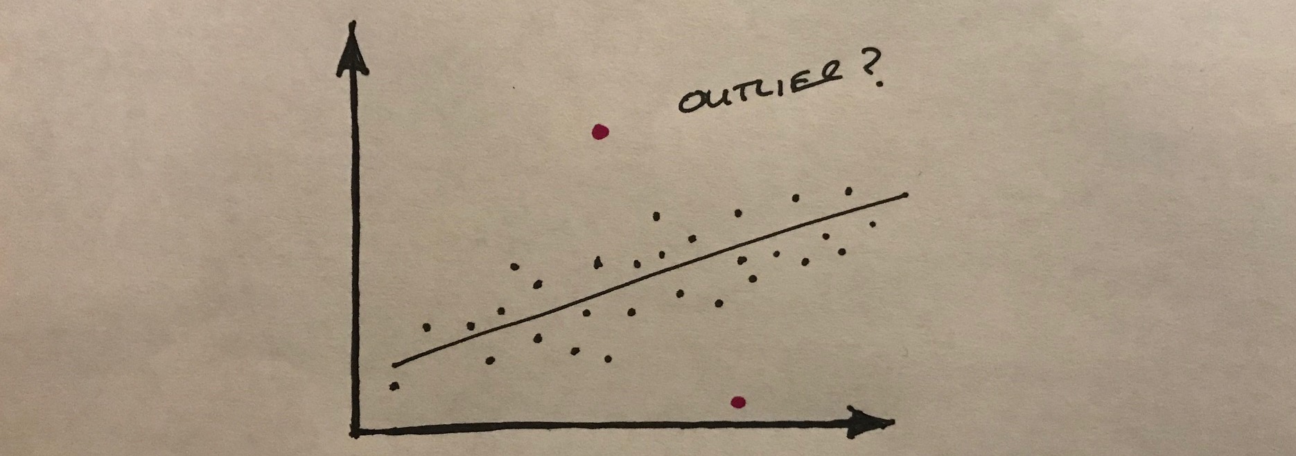
In the same way that we can tell whether a picture hanging on the wall is a bit out of level, we can often recognise things in data that don’t seem to be quite correct. If we see a value that is much greater, or smaller than most of the other values in the sample, we might start to think that there was something amiss.
The challenge is that when we are looking at very large datasets, we cannot observe the outliers very easily. We might miss them altogether.
One approach is to visualise the data as a scatter plot for example, to see whether there are any outliers. Alternatively we can use our trusty spreadsheet to help us find the strange data.
In MS Excel, the MAX function locates the largest value from a range as follows:
=MAX(start_of_range, end_of_range)
Conversely, the MIN function does the opposite:
=MIN(start_of_range, end_of_range)
These two functions can be a great help when we are doing the initial checks of data that has been collected from an IIoT device.
Leave a Reply